
Some people are blessed with the ability to make decisions quickly. Others of us, not so much. I have spent hours upon hours playing with our name pennant simulator trying color combos and helping you guys choose a combination you’ll love but honestly, I am sometimes paralyzed by the number of options for my own kids!
Cue the EPC color guide.
My hope is the color guide will help you narrow down your color options and settle on a perfect palette, but don’t forget I’m still just a DM away for color advice.
Before we can even get into color choices, a little background knowledge is necessary. On the first page of our guide, you’ll see where we break down the different parts of a pennant and where these colors you’re choosing will actually sit. Starting at the background, this is the large triangle piece on which everything else rests. It has the most surface area for a color to be showcased. On top of that will sit the “letters” of your name or words you chose. Lastly, over on the far left of your pennant there is a strip of felt along with ties, we call this part the “siding.”
Tips for narrowing down color combos:
With all of our colors laid out side-by-side in this guide, you can easily see every option and how they compare to each other. Don’t forget to use our color simulator to get an almost real life visual for how your colors look together.
1. Our first suggestion is to just PICK TWO COLORS.
In this scenario, you’ll pick one color for siding and letters and a second for your background.
Our most loved two color combo for mini monthly pennants is cream and beige. If you're looking for a brighter pennant, try our new indigo background.

beige background with cream letters and siding

indigo background with light blue letters and siding

coral background with plum letters and siding
2. Another option is to PICK 2 COLORS + 1 NEUTRAL.
Combining two different colors from around your room into one name pennant, is a great way to bring together your color scheme.

indigo background with cream letters and mustard siding
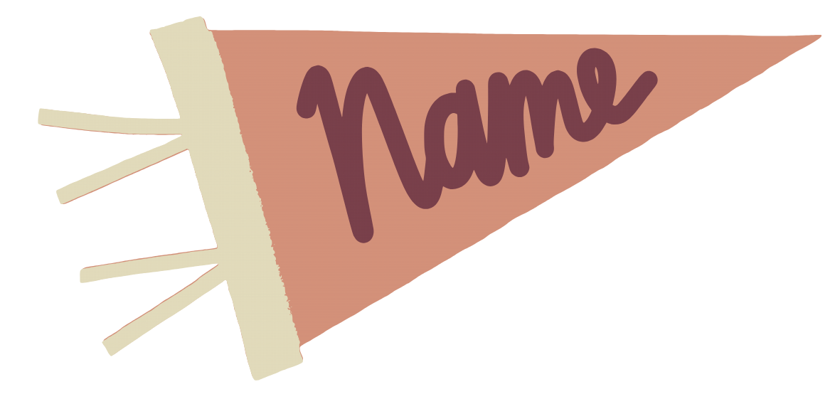
coral background with plum letters and cream siding

forest background with white letters and navy siding
3. We also love the idea of 2 MONOCHROMATIC COLORS + ONE NEUTRAL.
plum background with lilac letters and white siding

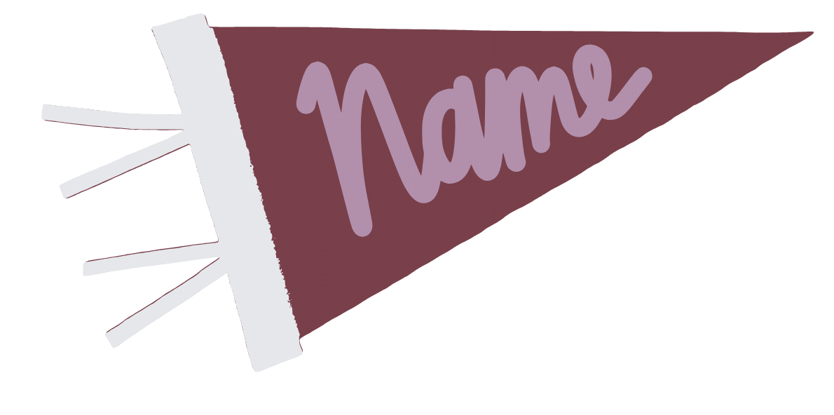
red background with cream letters and dark red siding

indigo background with cream letters and navy siding

beige background with navy letters and light blue siding
4. Our last suggestion is to find one color you really love and commit all the way with 3 MONOCHROMATIC COLORS. Pick all three colors from one color category.

light pink background with punch letters and magenta siding

beige background with cream letters and chestnut siding

indigo background with cerulean letters and light blue siding
Another note: If you’re still struggling to narrow down your colors, check out the last page on our guide. Pick the palette you are most drawn to. Which one looks most like your mood board or finished space? After selecting a palette, choose 2-3 colors from that category. Either two colors with a neutral, or three different colors. Some examples below:
Vintage

red background with cream letters and mustard siding

chestnut background with cream letters and navy siding
Modern

black background with white letters and light gray siding

light gray background with black letters and chestnut siding
Cottagecore

beige background with cream letters and sage siding

light pink background with chestnut letters and cream siding
Leave a comment